info@gpprint.co.uk   |   01733 340 622   |   About Us   |   FAQs   |   Blog   |   Log in
Need any help? Email us and we can do the rest.
By Kelly

The Psychology Behind Effective Print Design: How Colours, Fonts, and Layouts Impact Sales

Wed 9th October 2024

Ever wondered why some brochures catch your eye while others get tossed aside? Or why a flyer makes you feel compelled to act—whether that’s buying a product, attending an event, or simply visiting a website? The secret lies in the psychology behind effective print design. Believe it or not, the colours, fonts, and layouts you choose for your print materials can have a huge impact on how your audience feels and, ultimately, whether or not they take action.

At GP Print, we combine great design with high-quality printing to ensure your materials don’t just look good—they work. Let’s dive into how you can use psychology to boost your print marketing efforts!

From Screen to Print - Bringing Your Design Ideas to Life

From Screen to Print - Bringing Your Design Ideas to Life

Colours: Speak to Your Audience’s Emotions

Colours are powerful! They don’t just make things look pretty—they actually make people feel things. Each colour triggers specific emotional responses, which can influence behaviour. So, choosing the right colours for your print materials is key to connecting with your audience.

  • Red: It’s bold, energetic, and great for grabbing attention. That’s why it’s often used in sale ads or calls to action like “Buy Now” or “Limited Time Offer.”
  • Blue: Calm, trustworthy, and reliable—blue is perfect for businesses that want to build trust. You’ll often see blue in financial or tech sectors for that reason.
  • Yellow: Cheerful and optimistic, yellow catches the eye but in a friendly, warm way. It’s great for brands that want to convey happiness and positivity.
  • Green: Often associated with nature, health, and sustainability, green works wonders for brands in wellness, eco-friendly industries, or anything related to growth.
Pantone Colours - Colour Choice is Key to Your Branding

Pantone Colours - Colour Choice is Key to Your Branding

The key is understanding who your audience is and how you want them to feel. For example, if you’re running a fitness centre, a dynamic colour like red or orange might inspire energy and action. If you’re promoting a spa, you’ll want calming hues like green or soft blues. When we design your print materials, we help you choose the best colour palette to create the right emotional connection with your customers.

Fonts: More Than Just Letters

Fonts aren’t just a way to display your message—they are the message! The typeface you choose can tell people a lot about your brand, often before they even start reading. Here’s how different font styles speak to different audiences:

  • Serif Fonts (like Times New Roman): These are classic and sophisticated. They’re great for companies that want to convey tradition, trust, and authority, like law firms or luxury brands.
  • Sans Serif Fonts (like Arial or Helvetica): Clean, modern, and approachable. These fonts work well for tech companies, startups, or any business that wants to be seen as contemporary and easy to relate to.
  • Script Fonts (like Brush Script): Elegant and personal, script fonts add a sense of creativity and warmth. They’re perfect for wedding invitations, boutique brands, or anything that needs a personal touch.

But here’s the catch: you can’t just pick a pretty font and call it a day. Legibility is key! Your message has to be easy to read at a glance, especially on materials like business cards or flyers where space is limited. We’re here to help you choose fonts that not only look great but also make sure your message comes across clearly and effectively.

Serif, San Serif or Script Font - Which Style Suits Your Business Best?

Serif, San Serif or Script Font - Which Style Suits Your Business Best?

Layouts: Guiding the Customer Journey

Have you ever looked at a flyer and felt overwhelmed by a bunch of scattered text and images? That’s poor layout design at work. A well-structured layout doesn’t just look nice—it guides your customer’s eye through your material and leads them to the action you want them to take. Think of it as the map that directs them exactly where you want them to go.
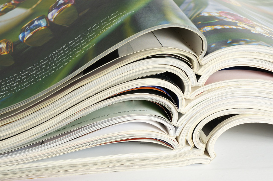
  • Visual Hierarchy: This is the order in which elements are arranged on the page. The most important info (like your main offer or product) should stand out first, followed by supporting details. Bold headlines, larger fonts, and eye-catching images help draw attention to key points.
  • White Space: Don’t be afraid to leave some breathing room! White space isn’t wasted space—it actually helps your design feel balanced and prevents your audience from feeling overwhelmed. It also allows important elements to stand out more.
  • Call to Action (CTA): Whether it’s “Buy Now,” “Call Today,” or “Visit Our Website,” your CTA needs to be easy to spot. Make it big, bold, and simple. After all, the goal of any print material is to encourage the reader to take action.
Effective Layout Guides and Leads Your Customers

Effective Layout Guides and Leads Your Customers

When we create your flyers, brochures, or posters, we focus on crafting a layout that doesn’t just look pretty—it works. We make sure your message is clear, and that every piece of information is placed where it makes the most impact.

How We Can Help You Boost Sales with Effective Print Design

At GP Print, we don’t just print your materials—we design them to succeed. We understand the psychology behind great print design, and we use that knowledge to craft marketing pieces that attract attention, build trust, and drive action.

Whether you need:

We’ve got you covered. Our team of expert designers and printers will work with you to create stunning, effective print materials that speak to your audience and boost your sales. Ready to make an impact with your print marketing? Contact us today and let’s get started on your next project!

Likes
« Back to Articles

Print Makes People Happy? What New Research Tells Us About Print Advertising

New research highlights how magazine advertising can build happiness, trust and relevance. Discover ...

Tue 27th October 2026

Read more...

How Small Businesses Can Look Like Bigger Brands

Discover how small businesses can look more established and professional through consistent branding...

Sat 17th October 2026

Read more...

Make It Personal: Bespoke Christmas Gift Ideas for 2026

Looking for personalised Christmas gifts? Discover bespoke drinkware, clothing, notebooks, calendars...

Sat 3rd October 2026

Read more...

Can AI Design Your Print? Here's What It Gets Right (and Wrong)

Can AI really design your business print? Discover what AI gets right, where it falls short and why ...

Sat 26th September 2026

Read more...

Travel Agent Print Marketing: Inspire Winter Getaways and Fill Next Year's Holiday Diary

Discover print marketing ideas for travel agents, from brochures and posters to planning packs and f...

Sat 19th September 2026

Read more...

What Makes Great Print Design? Five Principles Every Business Should Know

Discover five essential print design principles that can help your business create clearer, more pro...

Sat 5th September 2026

Read more...

Why Choosing the Right Paper Can Transform Your Print

Paper can change how your print looks, feels and performs. Discover how different stocks affect colo...

Sat 29th August 2026

Read more...

AI vs Professional Graphic Design: When Should You Use Each?

Discover when AI is the right tool for creating marketing materials and when professional graphic de...

Sat 22nd August 2026

Read more...

Before You Order Print: 10 Questions to Ask Yourself

Planning a print project? Discover the 10 essential questions every business should ask before order...

Sat 15th August 2026

Read more...

Stand Out from the Pack: The Print Every Pet Business Needs

Discover the essential print materials every dog grooming business needs, from service menus and loy...

Sat 8th August 2026

Read more...